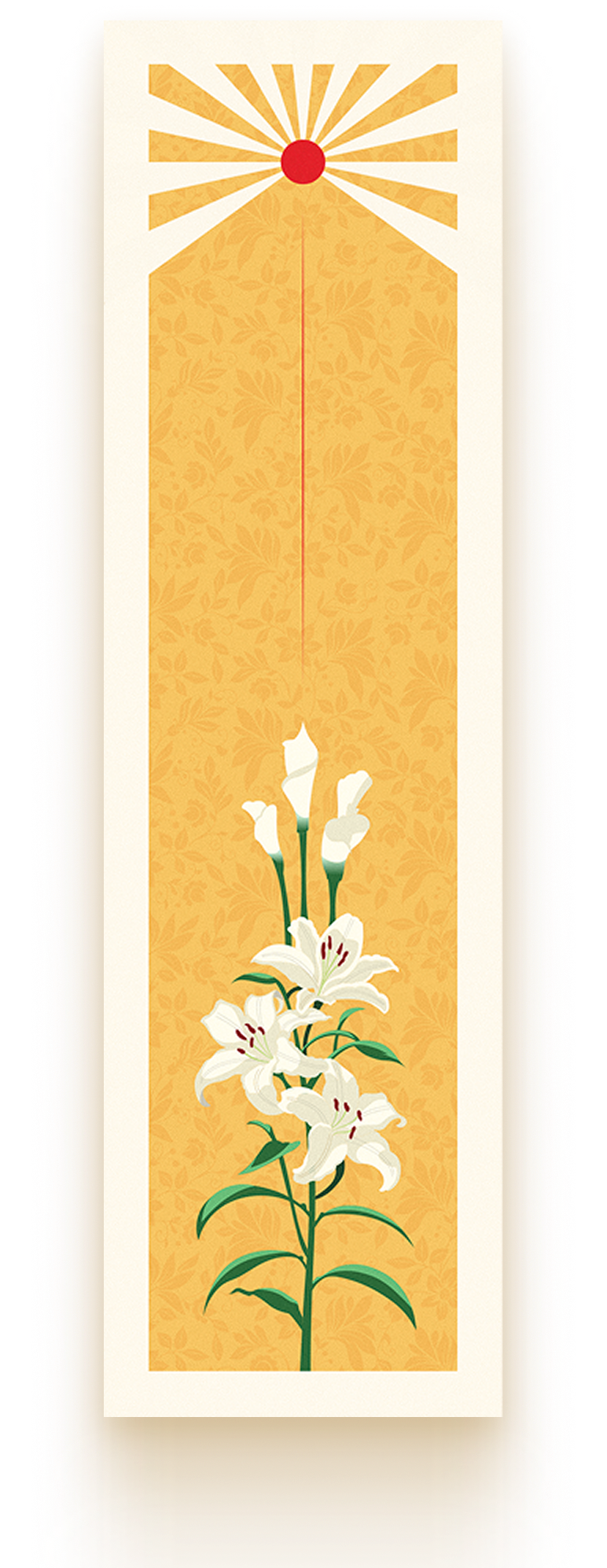
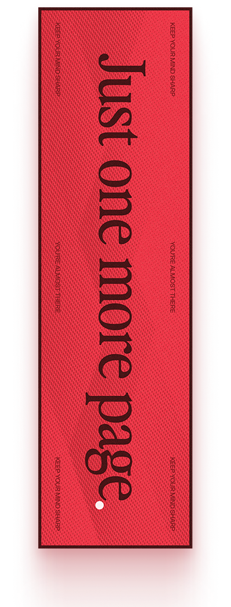
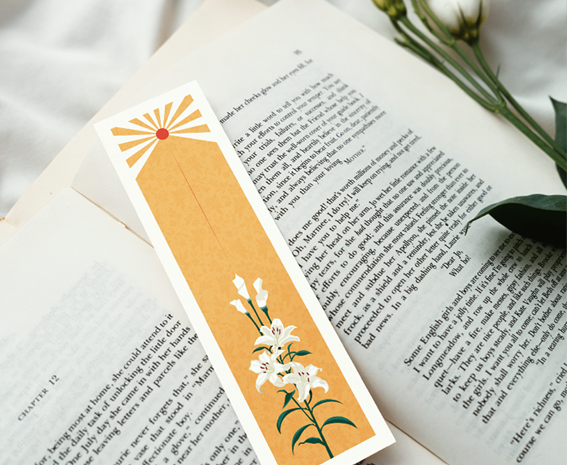
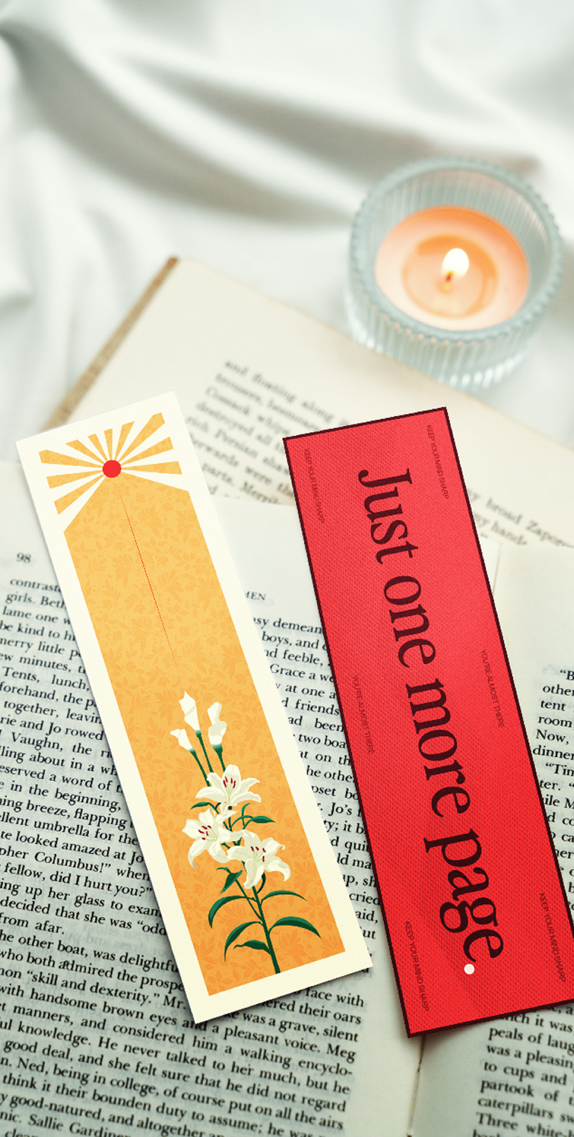
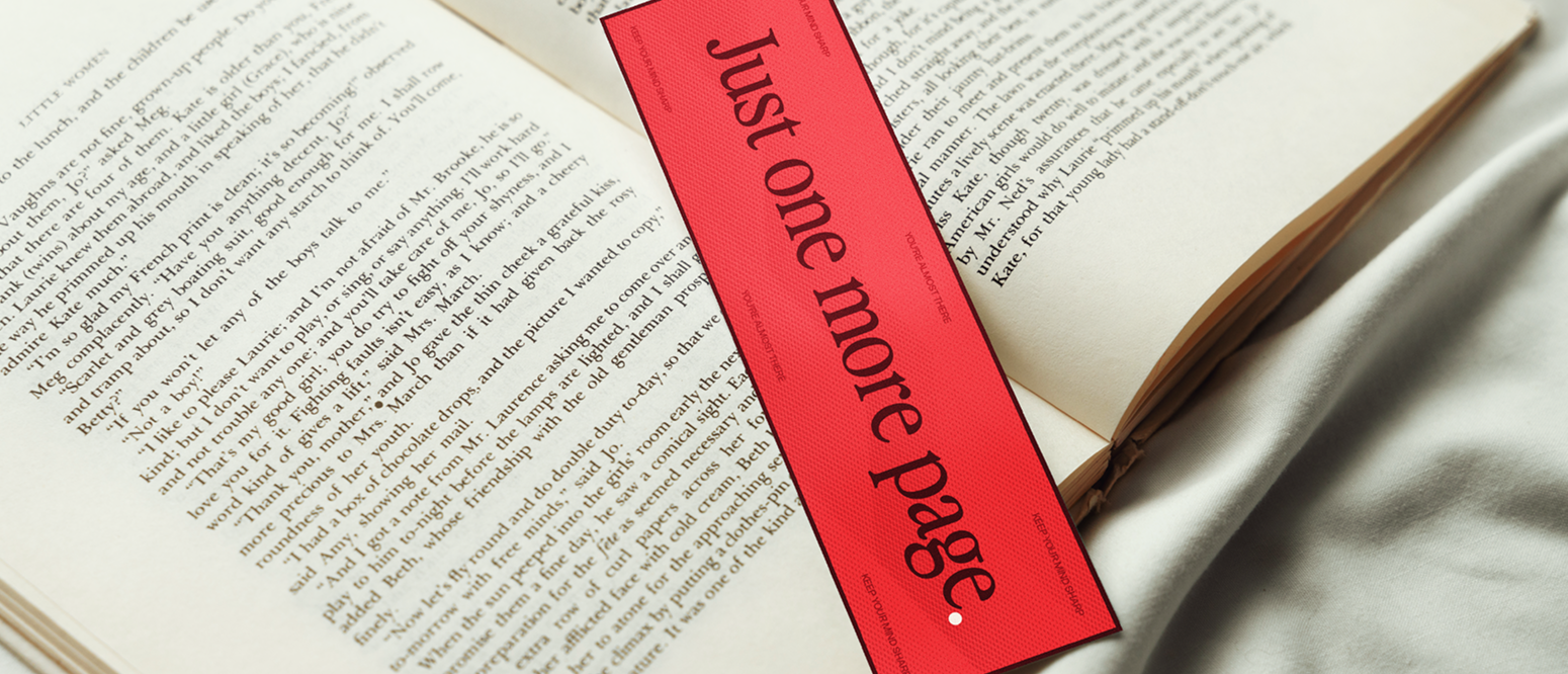
This trio of bookmarks grew out of a “back to basics” challenge, stripping away the noise to focus on quiet, natural occurrences: the sun, the stars, and the blooms in a loved one’s garden. To honor this “building blocks” philosophy, I limited the project to a primary palette of red, yellow, and blue. Returning to the DNA of color theory felt like the most authentic way to ground the imagery, using these foundational hues to create a cohesive set; each bookmark with their own individual character.
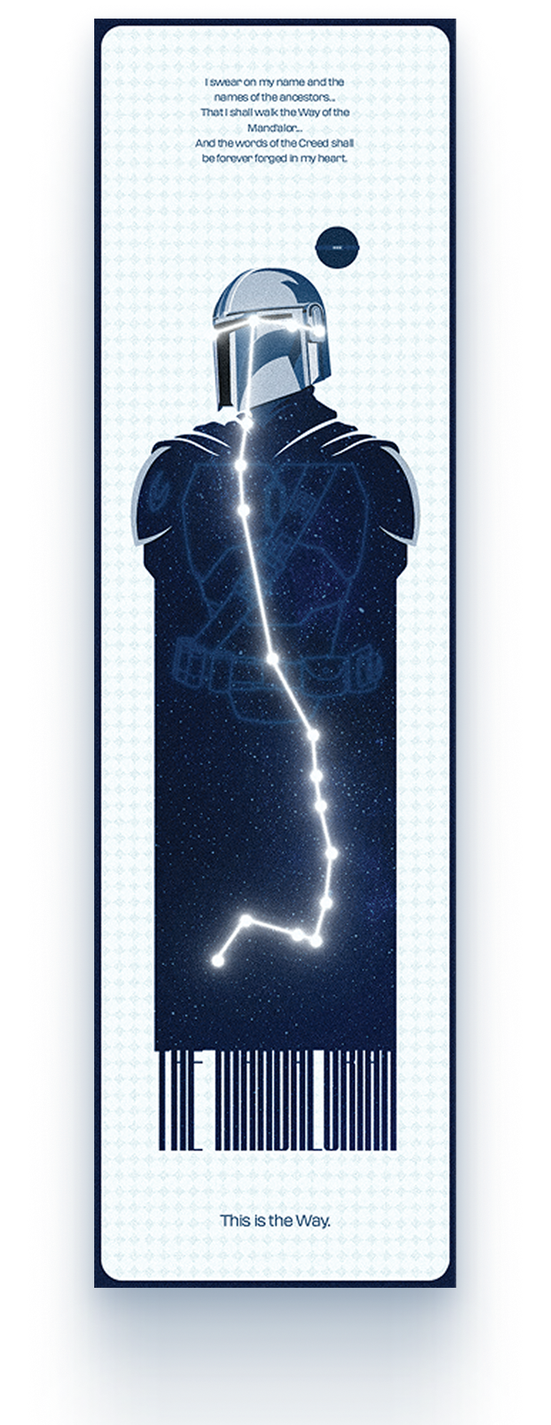
While the sun and garden provided literal inspiration, I leaned into conceptual associations for the final piece. The blue bookmark draws from The Mandalorian, bridging the vastness of the night sky with the stoic, professional energy of the character. By pairing these primary themes with clean typography and subtle textures, I aimed to prove that even a minimalist, restricted palette can convey distinct identities in a beautiful way.